
Historical Trends
While most reports focus on a specific period, the Historical Trends dashboard is your tool for seeing the big picture. It helps you zoom out and analyze your performance over months or even years, making it easy to spot long-term WordPress analytics trends.
The Historical Trends dashboard helps you analyze performance over time. Unlike other reports that focus on a specific period, this dashboard gives you the big-picture view: you can compare traffic growth across months or even years, making it easy to spot long-term WordPress analytics trends.
This guide explains how to use Historical Trends to track the growth of any metric, from site-wide traffic to specific conversion goals.
How to Use the Historical Trends Tool
Using the Trends report is a simple four-step process: choose what to analyze, choose the comparison mode, select the items to compare, and set the time frame.
Important Note: To generate a trend, you need at least two months of processed report data. If you have just installed the plugin, you may need to wait for your first full month to complete. You can then generate a report for the current, ongoing month at any time by going to the Tools & Status page and running the “Process Current Month” action. This will give you a second data point to start seeing trends immediately.
Step 1: Choose What to Report On
The first dropdown, “Report on:”, lets you select the type of entity you want to analyze. This is the starting point for your analysis. You can choose from a wide range of options, including:
- Site-Wide Summary: The overall health of your entire website.
- A Specific Page/Post: The long-term performance of a single piece of content.
- A Specific Source / Medium: How a traffic source (like google.com / organic) has performed over time.
- A Specific Country: The growth or decline of your audience in a particular region.
- An Event Category: The trend for a group of interactions, like all “Video” plays.
- A Specific Goal: The long-term conversion performance of a key business goal.
- And more…
Step 2: Choose Comparison Mode
If you select a category that supports comparison (such as Pages, Authors, Categories, etc.), a “Comparison Mode” option will appear. You can choose between:
- Auto: Top 5 Performers
The plugin automatically selects the top 5 highest-performing items in your selected date range and plots them on the charts. - Manual: Custom Selection
Search and select specific items to compare. Selected items will appear as removable “pills” below the search box.
Step 3: Find the Specific Item
Once you select an entity type that requires a specific item (such as “A Specific Page/Post…”) and choose Manual Custom Selection in the comparison mode, the “Find Specific Item:” search box will appear.
Simply start typing the name of the item you’re looking for. For example:
- If you chose “A Specific Page,” start typing the page’s title.
- If you chose “A Specific Goal,” start typing the goal’s name.
A list of matching items will appear. Click the one you want to analyze.
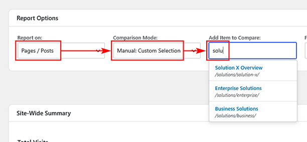
Step 4: Select Your Date Range & Apply
Use the “From” and “To” dropdowns to select the multi-month period you want to analyze. The report requires at least two months of data to show a trend. Once you’ve made your selections, click the “Apply” button.
Reading Your Trend Report
After you click “Apply,” the area below will populate with a series of line charts, showing the selected metrics. If you are comparing multiple items, each item will appear as a separate line on the charts for direct visual comparison.
For example:
- If you analyze a Goal, you will see charts for Completions, Conversion Rate, and Total Value over time.
- If you analyze a Page, you will see charts for Views, Entrances, Avg. Time on Page, Views as Exits, Assisted Conversions, and Conversion Value over time. If E-Commerce is active, Assisted Orders and Assisted Revenue charts will also be displayed. Assisted metrics are also available for Authors, Post Types, Terms, Traffic Sources, Campaigns, Marketing, and Custom Channel.
Each point on the chart represents the total for that specific month, allowing you to easily spot seasonal trends, identify periods of growth, and measure the long-term impact of your efforts. This is the core of analyzing your WordPress analytics trends.
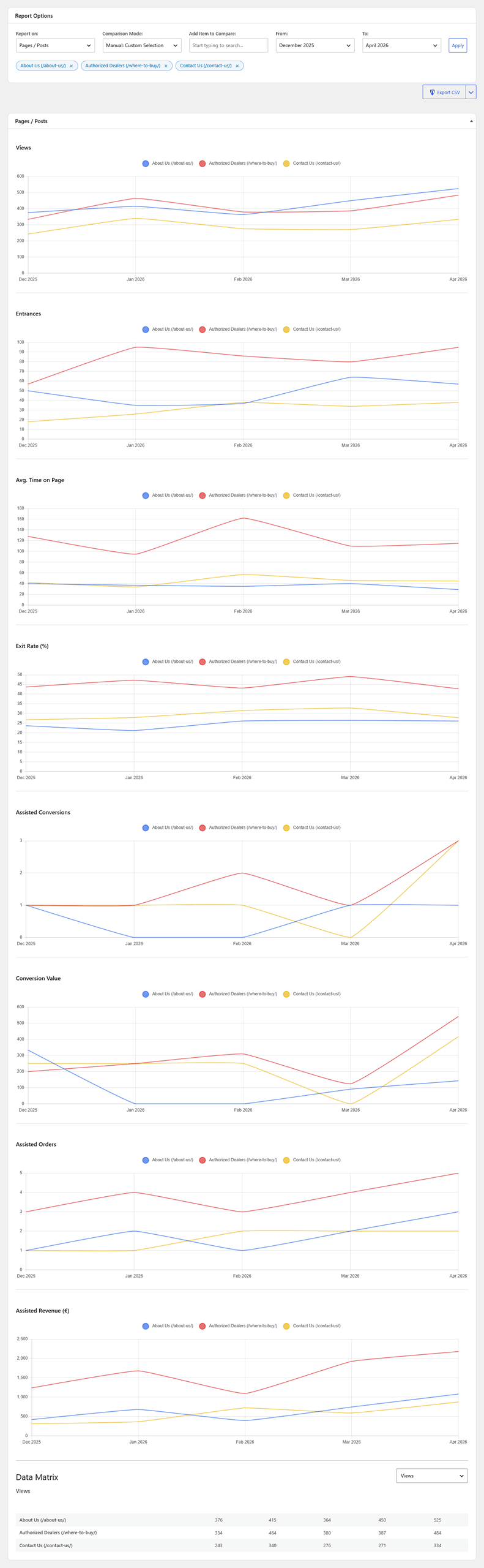
Below the charts, you will find the Data Matrix table. This table displays the exact raw numbers behind the charts, with rows representing the selected items and columns representing the months in your selected range. Use the dropdown above the table to switch between different metrics (Views, Entrances, Conversions, Revenue, etc.).