Moving Beyond the 30-Day Snapshot: Long-Term WordPress Trend Analysis
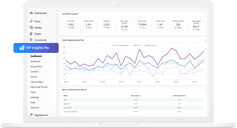
If you manage websites for clients, or if you run a serious content operation yourself, you are likely familiar with the standard monthly reporting routine. You pull the data for the last 30 days, compare it to the previous month, and look for percentage increases or decreases.
This 30-day snapshot is useful for basic health checks. It tells you if traffic spiked after a recent newsletter or if a server outage caused a dip.
However, a 30-day view is rarely enough to build a long-term strategy. It hides seasonal fluctuations, obscures the slow decline of older content, and makes it difficult to prove the compounding value of consistent SEO work. To make strategic decisions—to decide where to allocate budget or which topics to write about next quarter—you need to look at data over months and years, not just weeks.
Traditionally, performing long-term WordPress trend analysis often required exporting data into spreadsheets or relying on external Business Intelligence (BI) tools.
With the latest update to WP Insights Pro, the Historical Trends dashboard now supports multi-item comparisons directly inside the WordPress admin, making it easier to analyze historical performance trends without leaving your workflow.
Here are a few practical ways agencies, consultants, and site owners can use long-term, multi-item comparisons to better understand how content, campaigns, and traffic sources perform over time.
1. Identifying Content Decay (and Evergreen Winners)
Traffic rarely stays flat. A blog post might get a massive surge of traffic when it is first published and shared on social media, only to see that traffic drop to zero a week later. Another post might start slow but steadily gain organic search traffic month over month.
Looking at a standard “Top Pages” report for a single month won’t reveal this dynamic. A dying post and a growing post might have the exact same number of views in May, but their trajectories are completely different.
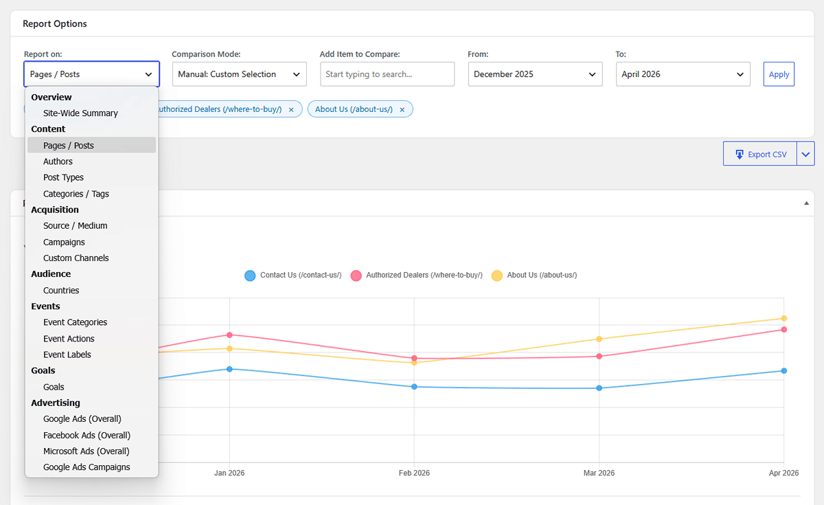
The Strategy: Using the Historical Trends dashboard, you can select Pages / Posts, switch to Manual Selection, and search for 3 or 4 of your historically popular articles. Plotting them on a single chart makes long-term patterns much easier to identify.
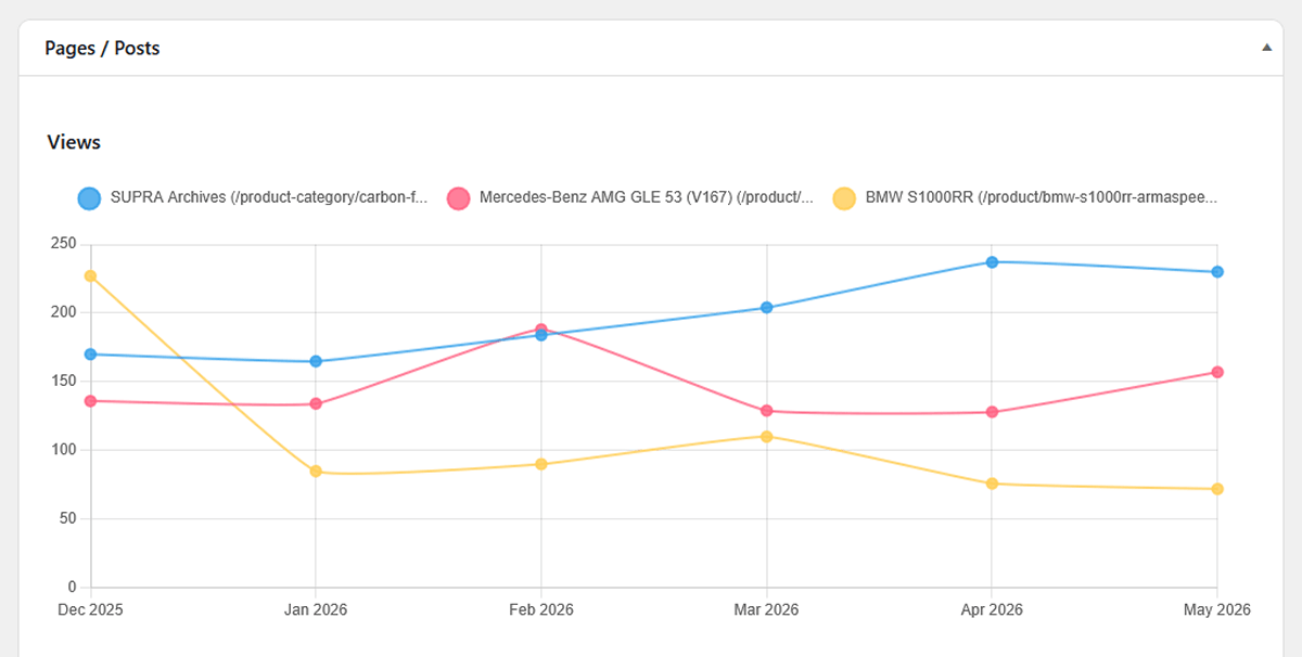
If you see a previously strong article slowly trending downward over the last three months, you have identified content decay. In many cases, identifying this kind of decline can help you decide which articles may benefit from updates, rewrites, or refreshed internal linking.
2. Proving the ROI of Content Categories
If you are an agency running a content strategy for a client, you often need to justify where the writing budget is going. Are the in-depth “Tutorials” providing more value than the short “Company News” updates?
Total pageviews can be misleading here. News articles might get a quick burst of clicks, but tutorials might keep readers on the site longer and lead to lower bounce rates over time.
The Strategy: In the Trends report, select Categories / Tags as your entity type. You can use the Auto: Top 5 Performers mode to let the plugin instantly chart your best categories over the last year.
By looking at the Average Time on Page trend chart for these categories, rather than just views, you can better demonstrate to a client which topics are actually holding their audience’s attention month over month. This can help support editorial decisions with longer-term engagement data rather than relying only on short-term traffic spikes.
3. Evaluating Campaign Performance Over Time
Marketing campaigns often overlap. You might be running a Google Ads campaign, a Facebook initiative, and an ongoing email newsletter sequence simultaneously.
While the standard Acquisition report shows you who won this month, it doesn’t show you staying power.
The Strategy: Select Campaigns in the Trends picker. By comparing your major UTM campaigns over several months, you can better understand how different marketing efforts perform over time. You might find that while social media campaigns provide excellent short-term spikes, your email campaigns drive a slower but more consistent stream of returning traffic.
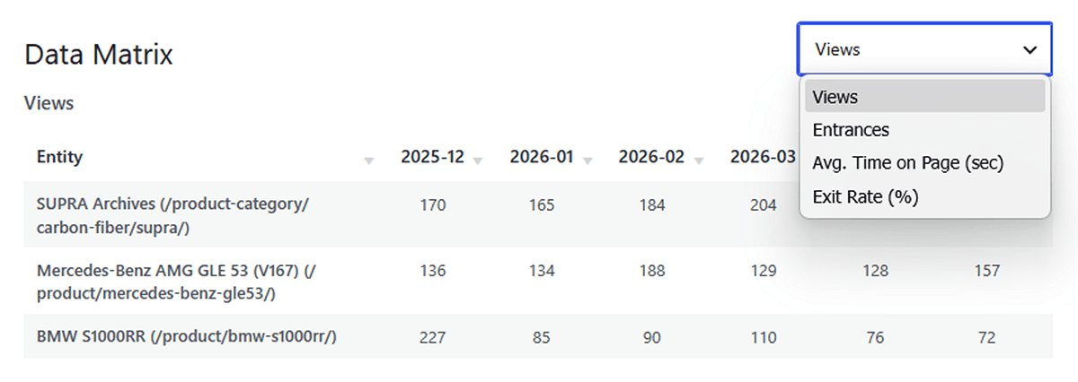
The Data Matrix: For the “Numbers People”
While visual charts are excellent for spotting trends and presenting to clients, sometimes you or your analysts just need to see the raw numbers.
For users who want to inspect the underlying numbers, every Historical Trends report also includes a Data Matrix table below the charts. This table places your selected items in rows and the months in columns. You can instantly sort any month to see exactly who performed best in that specific period, or toggle the dropdown to view the matrix for different metrics like Entrances or Bounce Rate.
Moving from Reporting to Advising
Analytics becomes far more useful when it helps explain long-term patterns rather than just short-term fluctuations.
By looking beyond the standard 30-day snapshot, long-term WordPress trend analysis can help agencies and site owners better understand what is growing, what is slowing down, and where future opportunities may exist.
Ready for Zero-Bloat Analytics?