Audience Reports
The Audience reports are where you go to answer the fundamental question: “Who are my visitors?”
This collection of reports helps you understand the geographic, technological, and behavioral characteristics of your audience. By knowing who your visitors are, you can make better decisions about your content, design, and marketing. This guide will walk you through each tab of your WordPress audience analytics report.
Overview Tab
The Overview tab provides a high-level summary of your audience’s key characteristics for the selected date range. It’s the perfect place to spot major trends at a glance before diving into the more detailed reports.
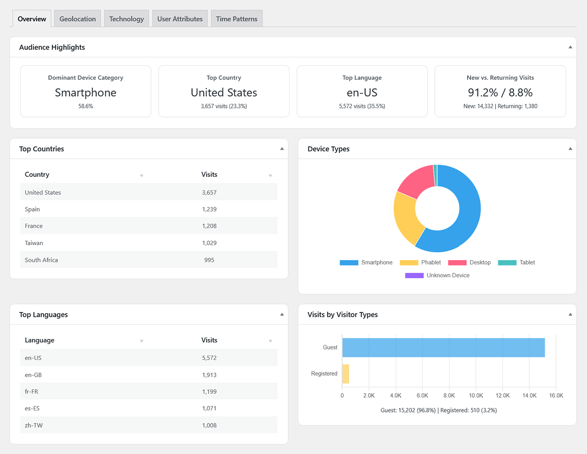
Audience Highlights (Scorecards)
The four scorecards at the top give you an instant snapshot of your audience profile:
- Dominant Device Category: This shows the most common device type (Desktop, Smartphone, or Tablet) used by your visitors, along with the percentage of total visits it represents.
- Top Country: Identifies the country that sent you the most traffic during the period, showing the total number of visits and its percentage of all visits.
- Top Language: Displays the most common browser language setting of your visitors, along with its visit count and percentage.
- New vs. Returning Visits: This scorecard shows the percentage split between first-time visitors and those who have been to your site before. The detail line below provides the exact number of new vs. returning visits.
Charts & Top Lists
The rest of the overview provides a quick visual summary of your most important audience segments:
- Top Countries Table: A quick list of your top 5 countries by visit count.
- Device Types Chart: A doughnut chart visualizing the breakdown of visits by device category.
- Top Languages Table: A list of the top 5 most common browser languages.
- Visits by Visitor Types Chart: A simple chart comparing the total visits from logged-in (“Registered”) users versus logged-out (“Guest”) visitors.
Geolocation Tab
This report answers the question: “Where in the world are my visitors located?”
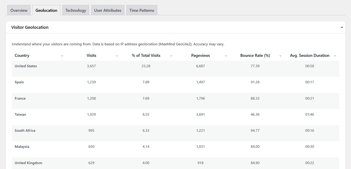
The main table lists every country that sent you traffic during the period, sorted by the number of visits. For each country, you can see key engagement metrics:
- Visits: The total number of sessions from that country.
- % of Total Visits: The percentage of your site’s total visits that came from that country.
- Pageviews: The total pages viewed by visitors from that country.
- Bounce Rate (%): The bounce rate specifically for visitors from that country.
- Avg. Session Duration: The average session length for visitors from that country, helping you see how engaged different regions are.
Drilling Down to City-Level Data
For many countries, you can dive deeper to see a city-level breakdown.
- Action: Click the “View Cities” link that appears when you hover over a country row.
- Result: A modal window will pop up, showing you a list of the top cities within that country that are sending you traffic.
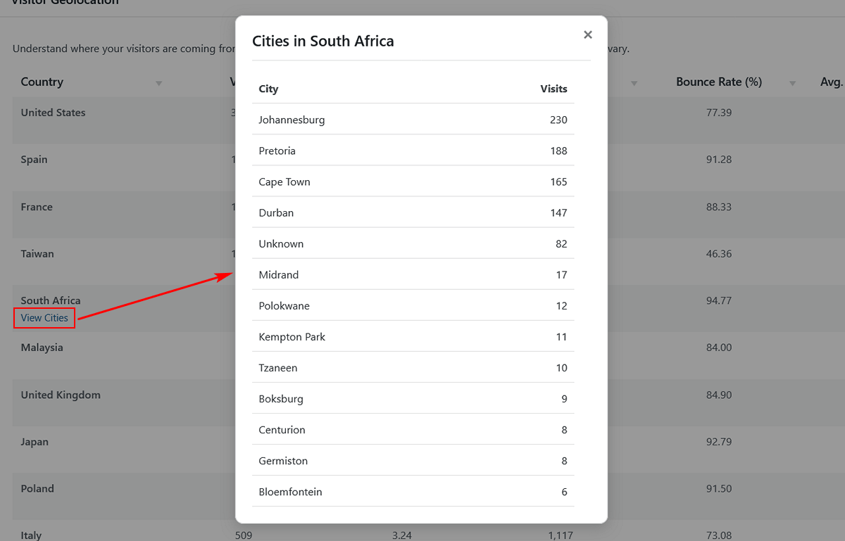
Pro Tip: If you see “No Cities” for all countries, it likely means you haven’t added your free MaxMind license key yet. Head over to our Settings Guide to learn how to enable detailed city-level tracking.
Technology Tab
This report answers: “What technology are my visitors using to browse my site?” Understanding this is crucial for ensuring your site looks and works great for everyone.
This view is broken down into four key reports:
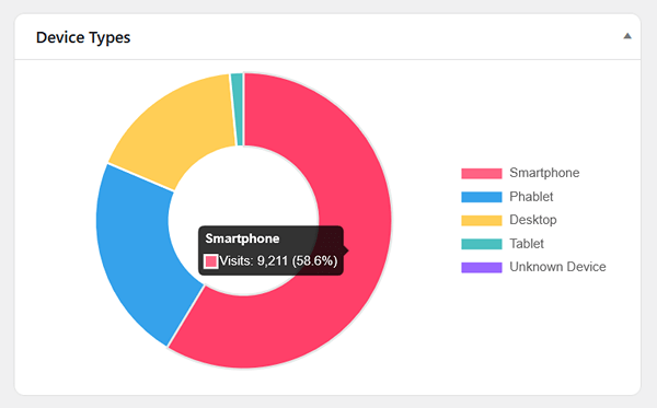
- Device Types: A chart showing the breakdown of visits from different device categories. While this typically includes Desktop, Smartphone, and Tablet, it can also identify more specific types like Phablet, Console, or TV if they are detected. Use this data to decide if you should prioritize a mobile-first or desktop-centric design.
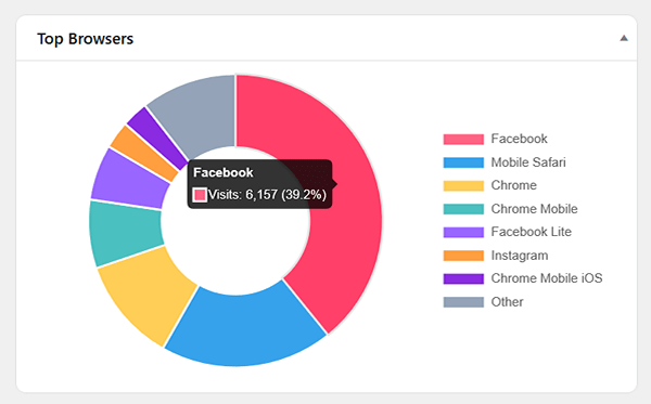
- Top Browsers: See which browsers (e.g., Chrome, Safari, Firefox) are most popular with your audience. This can be helpful for testing and debugging.
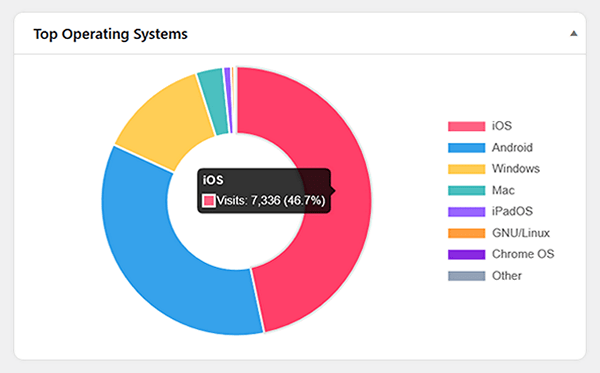
- Top Operating Systems: Understand the split between Windows, macOS, iOS, Android, and other operating systems.
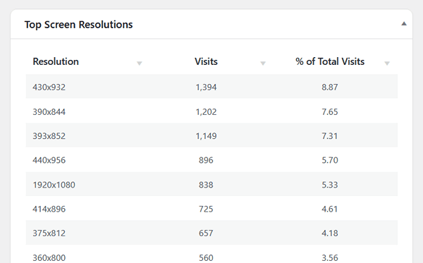
- Top Screen Resolutions: This table shows the most common screen sizes your visitors are using. It’s a powerful tool for your design team to ensure your site is optimized for the most popular resolutions.
User Attributes Tab
This tab provides more specific details about your audience’s characteristics.
- Browser Languages: This table shows the primary language setting from your visitors’ browsers (e.g., en-US, es-ES, fr-FR). This can help you decide if you should consider offering translations of your content. The table includes:
- Language: The language code reported by the browser.
- Visits: The total number of sessions from visitors with that language setting.
- % of Total Visits: The percentage of your site’s total traffic that uses that language.
- User Types: This chart compares the behavior of visitors who are logged out (Guest) versus those who are logged in to a WordPress account on your site (Registered).
Time Patterns Tab
This report helps you answer: “When is my audience most active?”
- Visits by Day of Week: This bar chart shows you which days of the week are the busiest for your website. Use this to schedule your most important content and promotions.
- Visits by Hour of Day: This chart breaks down traffic by the hour of the day (in UTC). It’s a great way to pinpoint the exact time your audience is most engaged.
Next Steps
Now that you have a deep understanding of who your audience is, the next logical step is to explore how they are finding your website.