Dashboard
The WP Insights Pro Dashboard provides an overview of your site’s performance in one place without overwhelming you with data.
This guide will walk you through each component of the dashboard, explaining what the metrics mean and how you can use them to make better decisions.
Understanding the Key Metrics Snapshot
The row of scorecards at the top of the dashboard provides a quick summary of your most important top-level metrics for the selected date range.
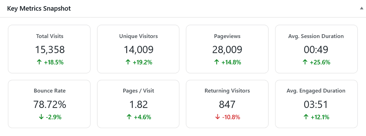
Here’s what each metric means:
- Total Visits: This is the total number of sessions on your site. A session begins when a visitor arrives and ends after 30 minutes of inactivity (or your custom session timeout). If the same person visits your site in the morning and again in the evening, that counts as two visits.
- Unique Visitors: This counts the number of distinct individuals who have visited your site. We use a privacy-friendly salted hash to identify unique visitors, so if the same person visits three times in the selected period, they are only counted once here.
- Pageviews: The total number of pages viewed. A single visit can have multiple pageviews.
- Avg. Session Duration: The average length of a visitor’s session. This is calculated by summing the duration of all sessions and dividing by the total number of visits.
- Bounce Rate: The percentage of visits that consisted of only a single pageview. A visitor who lands on a page and leaves without clicking to another page is considered a “bounce.” A lower bounce rate is generally better.
- Pages / Visit: The average number of pages a visitor views during a single session. A higher number often indicates greater engagement.
- Returning Visitors: This shows the number of unique visitors in the selected period who had also visited your site at least once before this period began.
- Avg. Engaged Duration: The average session duration, but excluding single-page “bounce” sessions. This metric gives you a more accurate picture of how long truly engaged visitors are spending on your site.
- Comparison Mode (Optional): If you have “Enable Comparison” turned on in your settings, you’ll see a percentage change below each metric, comparing it to the previous equivalent period. This is a powerful way to spot trends instantly.
The Main Trend Chart: Visits & Pageviews
This chart is your primary tool for visualizing traffic trends over time. It adapts based on the length of the date range you’ve selected.
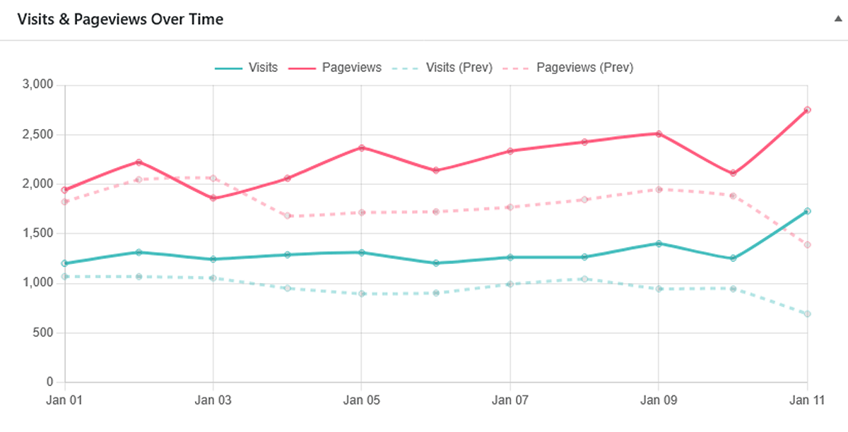
- For Multi-Day Ranges (e.g., “Last 30 Days”): The chart displays a daily trend line, allowing you to see which days of the week or which specific dates brought in the most traffic. You can hover over any point on the chart to see the exact numbers for that day.
- For Single-Day Ranges (e.g., “Today”): When you select a single day, the chart automatically switches to an hourly view. This is a powerful feature for understanding when your audience is most active during the day, which can help for timing your blog posts or social media announcements. The times shown are in UTC.
- Visual Comparison: If “Enable Comparison” is enabled in your plugin settings, the chart overlays a dashed line representing traffic from the previous equivalent period. This helps you quickly compare current performance against recent historical trends.
New vs. Returning Visitor Metrics
This table helps you understand user loyalty and engagement. It breaks down key performance metrics for first-time visitors compared to those who have been to your site before.
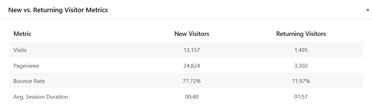
Often, you’ll find that returning visitors have a lower bounce rate and a higher average session duration, which is a great sign of a healthy, engaging website.
Top Lists: Your Quick-Reference Dashboards
The bottom section of the WordPress analytics dashboard contains four “Top 10” lists to help you quickly identify your best-performing content and traffic sources without having to dive into the detailed reports.
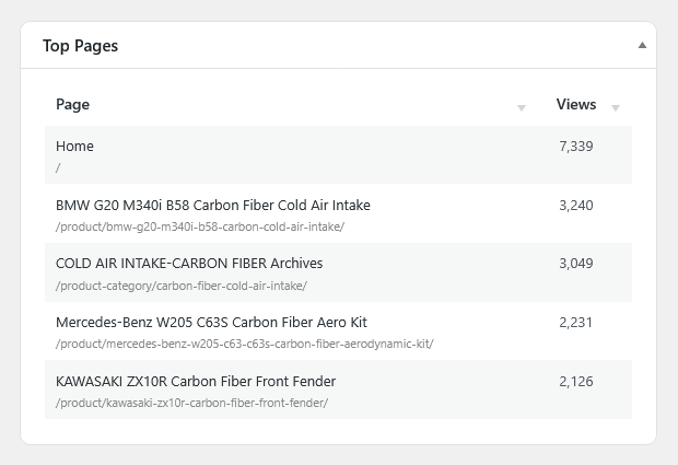
- Top Pages: Shows your most viewed pages during the selected period.
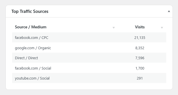
- Top Traffic Sources: Displays the Source/Medium combinations (e.g., google.com / organic, facebook.com / referral) that are sending you the most visits.
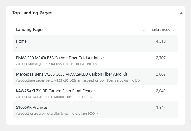
- Top Landing Pages: Shows the pages where visitors most often begin their sessions. These are your site’s most important “front doors.”
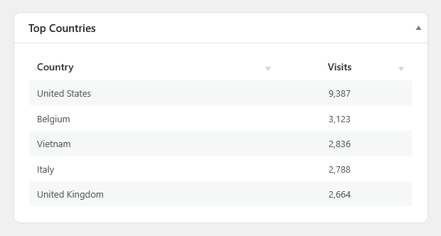
- Top Countries: Displays the countries where most of your visitors are located.
Next Steps
The Dashboard is your starting point. When you see something interesting—like a spike in traffic from a new source or a page that’s suddenly performing well—you can dive deeper by exploring the dedicated reports.
Next, you can explore the Audience Reports for a detailed view of your visitors.